Product and collection Link to this heading
The sections of the product page, the collection page and the list of all collections.
Product information Link to this heading
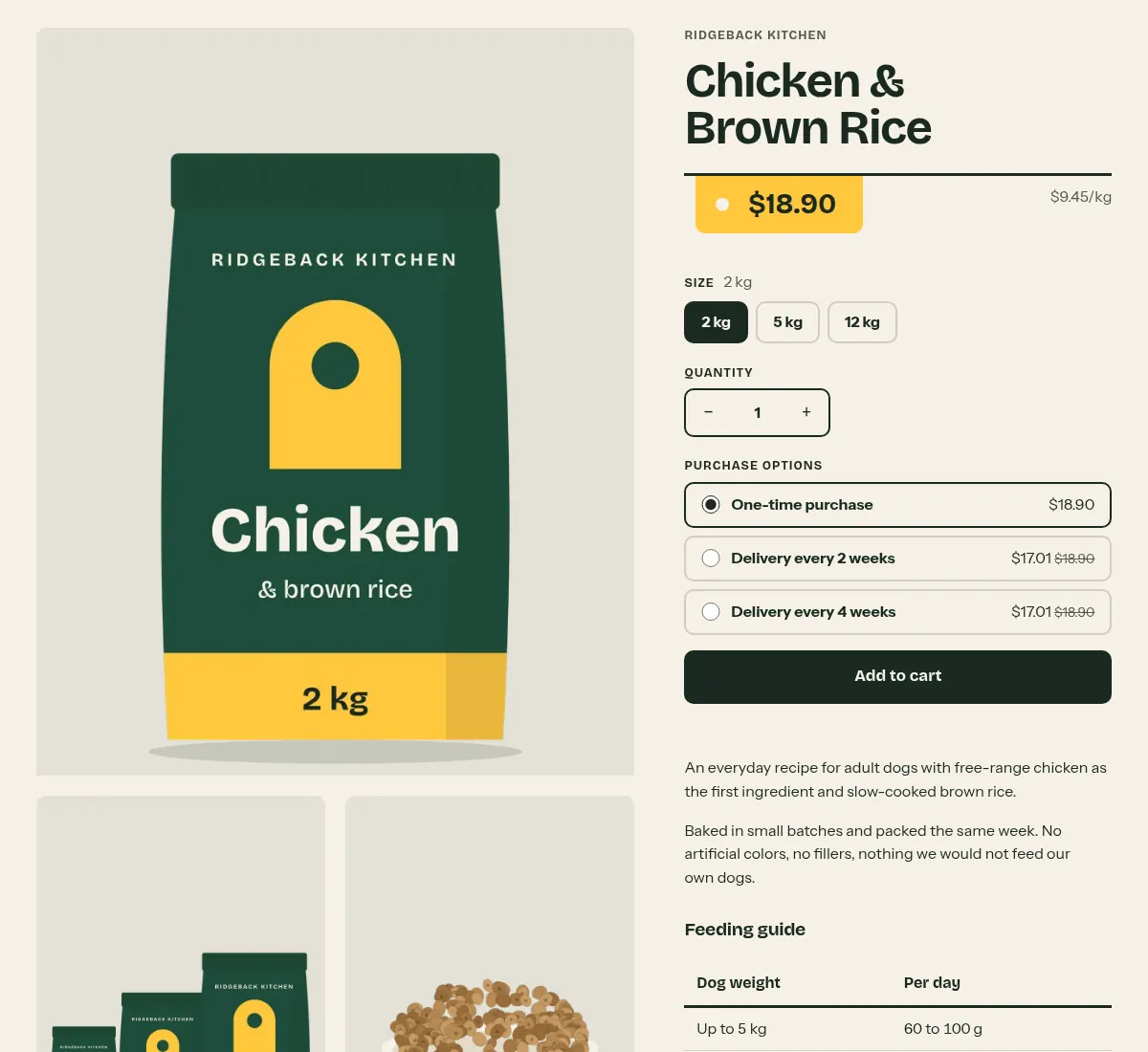
The main section of every product page. Media stand on plates on the left, the product information on the right is built from blocks you can reorder, remove or add again. Option values are links to the variant, so the page works without JavaScript.
Where it appears: Used in template product. Cannot be added from Add section; it is part of the template.
Settings Link to this heading
| Setting | What it does | Values | Default |
|---|---|---|---|
| Color scheme | Colors of the product section. | Color scheme | Scheme 1 |
Blocks Link to this heading
App blocks Link to this heading
Blocks that apps provide, for example product reviews or size charts. They appear under Add block once the app is installed.
Vendor Link to this heading
The product's vendor. Can be used once per section.
Title Link to this heading
The product title. Can be used once per section.
Price Link to this heading
The price, the compare-at price on sale, and the unit price when the variant has one. Can be used once per section.
| Setting | What it does | Values | Default |
|---|---|---|---|
| Show tax and shipping note | Shows a line below the price saying that taxes are included (when your prices include tax) and, if you have a shipping policy, a link to it. | On or off | On |
| Show Shop Pay InstallmentsHint in the editor: Shown when Shop Pay Installments is available for the store. | Shows the Shop Pay Installments message below the price. | On or off | On |
Description Link to this heading
The full product description. Can be used once per section.
Variant picker Link to this heading
One group of buttons per product option, such as size or color. Hidden when the product has only one variant. Can be used once per section.
| Setting | What it does | Values | Default |
|---|---|---|---|
| Show swatchesHint in the editor: Add swatches to your product options in the Shopify admin. | Shows the color or image swatch on each option button. See Variant swatches. | On or off | On |
Quantity selector Link to this heading
A field with minus and plus buttons for the quantity. Can be used once per section.
Buy buttons Link to this heading
The Add to cart button. Also shows purchase options for subscriptions and the recipient form for gift cards when the product has them. Can be used once per section.
| Setting | What it does | Values | Default |
|---|---|---|---|
| Show dynamic checkout buttonsHint in the editor: Customers see their preferred payment method, such as PayPal or Apple Pay. | Adds express payment buttons, such as Shop Pay, below Add to cart. | On or off | On |
Pickup availability Link to this heading
Whether the selected variant can be picked up at your locations, with a list of stores. Can be used once per section.
Complementary products Link to this heading
A short list of products that go with this one, from the Search & Discovery app. Can be used once per section.
| Setting | What it does | Values | Default |
|---|---|---|---|
| Select complementary products in the Search & Discovery app. | |||
| Heading | Heading above the list. | Text | “Pairs well with” |
| Products to show | Maximum number of products in the list. | 1 to 4, in steps of 1 | 3 |
Collapsible row Link to this heading
A row that opens and closes, for details such as ingredients, feeding amounts or care.
| Setting | What it does | Values | Default |
|---|---|---|---|
| Heading | The visible line of the row. | Text | “Collapsible row” |
| Body text | The text shown when the row is open. | Formatted text | “Share details such as ingredients, sizing, or care instructions.” |
| PageHint in the editor: Page content replaces the body text. | Use the content of one of your pages instead, for example a shipping page that several products share. | Page | — |
Custom Liquid Link to this heading
Your own Liquid or HTML inside the product information, for example an app snippet.
| Setting | What it does | Values | Default |
|---|---|---|---|
| Custom LiquidHint in the editor: Add app snippets or other code to create advanced customizations. | The Liquid or HTML to output. | Liquid code | — |
Related products Link to this heading
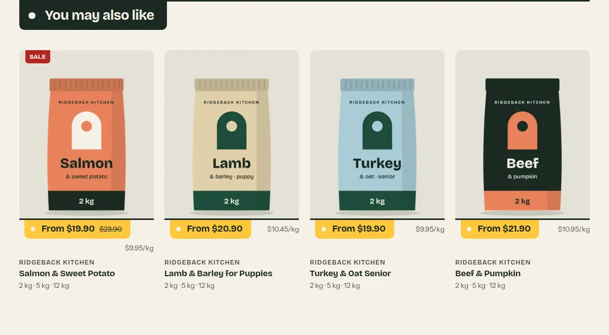
Products recommended by Shopify for the product being viewed. The row loads when it scrolls into view.
Where it appears: Used in template product. Can be added to product templates only.
Settings Link to this heading
| Setting | What it does | Values | Default |
|---|---|---|---|
| Recommendations change and improve over time. Adjust them in the Search & Discovery app. | |||
| Heading | Heading that hangs from the shelf line. | Text | “You may also like” |
| Products to show | Maximum number of recommended products. | 2 to 8, in steps of 1 | 4 |
| Columns on large screens | Number of products in a row on large screens. Phones show two in a row, tablets three. | 3 to 5, in steps of 1 | 4 |
| Color scheme | Colors of the section. | Color scheme | Scheme 1 |
Collection Link to this heading
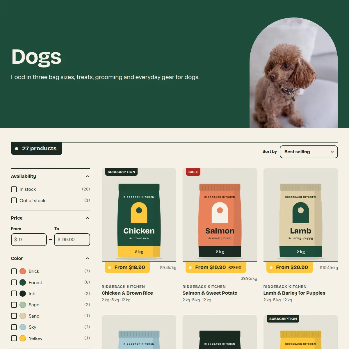
The collection page: a color band with the title and the collection image as an arch, then a bar with the product count and sort order, the filters and the products. Filters and sorting are one form, so the page works without JavaScript; with JavaScript, results update in place.
Where it appears: Used in template collection. Cannot be added from Add section; it is part of the template.
Settings Link to this heading
| Setting | What it does | Values | Default |
|---|---|---|---|
| Header | |||
| Show collection imageHint in the editor: Uses the collection image. Set its focal point in the Shopify admin. | Shows the collection image as an arch in the color band at the top. | On or off | On |
| Show collection description | Shows the collection description below the title. | On or off | On |
| Color scheme | Colors of the band at the top of the page. | Color scheme | Scheme 2 |
| Products | |||
| Products per page | Number of products on each page before the page links. | 8 to 48, in steps of 4 | 24 |
| Columns on large screens | Number of products in a row on large screens. Phones show two products in a row, tablets three. | 2 to 4, in steps of 1 | 3 |
| Enable filteringHint in the editor: Customize filters with the Search & Discovery app. | Shows the filters you set up in the Search & Discovery app, as a side column on large screens and behind a button on phones. | On or off | On |
| Show filter group names on active filters | Puts the filter name before each active filter, for example Size: 2 kg instead of 2 kg. | On or off | Off |
| Enable sorting | Shows the sort order menu above the products. | On or off | On |
Collections list Link to this heading
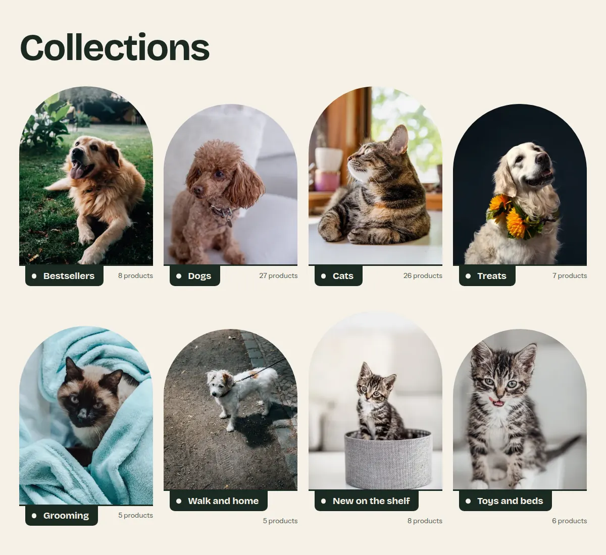
The page that lists all collections (/collections). Each collection is an arch standing on a shelf line, with its name hanging from the line.
Where it appears: Used in template list-collections. Cannot be added from Add section; it is part of the template.
Settings Link to this heading
| Setting | What it does | Values | Default |
|---|---|---|---|
| Collections per page | Number of collections on each page before the page links. | 4 to 48, in steps of 4 | 24 |
| Show product count | Shows how many products each collection holds. | On or off | On |
| Color scheme | Colors of the page. | Color scheme | Scheme 1 |
Hutch theme documentation · theme version 1.0.0 · last updated November 16, 2026 · Contact support · Legal notice