Home page sections Link to this heading
These nine sections make up the home page after you install Hutch, in this order. Each one starts on a shelf line: the heading hangs from the line as a label, a View all link stands on the right where it makes sense. You can remove, reorder or repeat them, and add them to other templates too. Open Online Store > Themes > Customize to edit them.
Hero Link to this heading
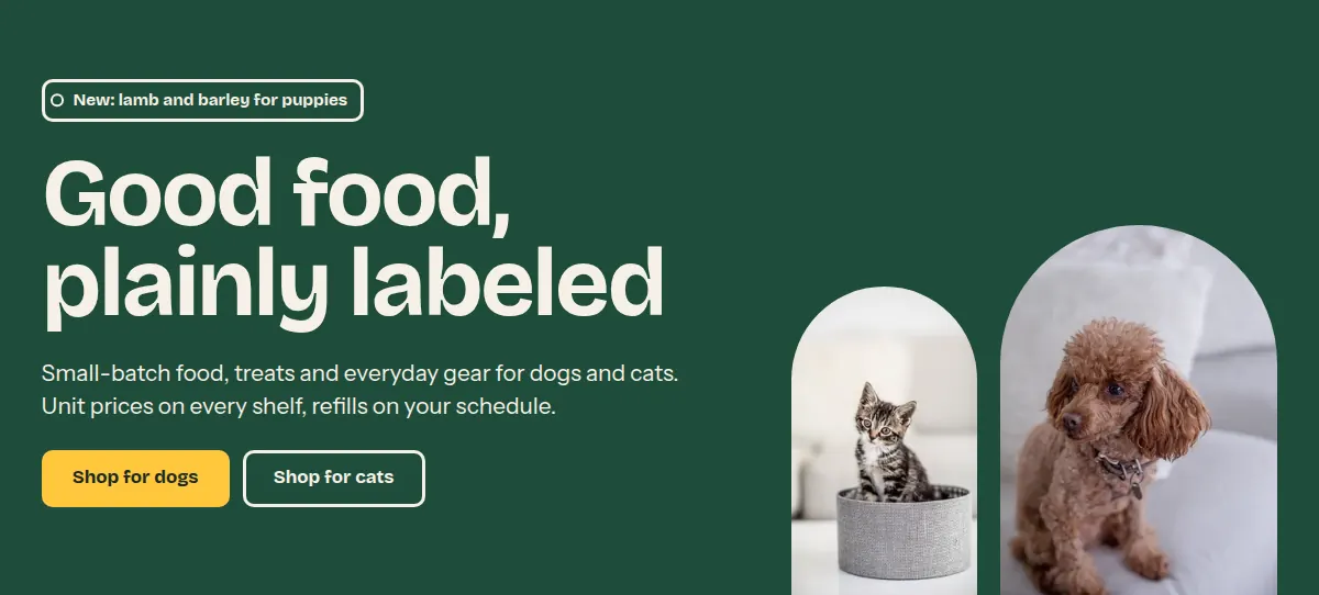
The opening band of the page. A large heading, a short text and up to two buttons sit on a color band; one large and one small arched image stand on the lower edge of the band. On phones the images sit below the text.
Where it appears: Used in template index. Can be added to any template; not to the header or footer group.
Settings Link to this heading
| Setting | What it does | Values | Default |
|---|---|---|---|
| Label | A short label above the heading. | Text | “New arrivals” |
| Heading | The large heading on the color band. | Text | “Introduce your store” |
| Body text | One or two sentences below the heading. | Formatted text | “Tell customers what you sell and who it is for. Keep it to one or two sentences.” |
| Button label | Text of the first button. It uses the button colors of the section's color scheme. Leave empty to hide it. | Text | “Shop all” |
| Button link | Where the first button leads. | Link | — |
| Second button label | Text of a second, quieter button. Leave empty to hide it. | Text | — |
| Second button link | Where the second button leads. | Link | — |
| Images | |||
| Large imageHint in the editor: 3:4 aspect ratio recommended | The large arched image standing on the lower edge of the band. | Image | — |
| Show small image | Adds a second, smaller arch beside the large one. | On or off | On |
| Small imageHint in the editor: 3:5 aspect ratio recommendedShown in the editor only when Show small image is on. | The image in the small arch. | Image | — |
| Color scheme | Colors of the band. | Color scheme | Scheme 2 |
Collection list Link to this heading
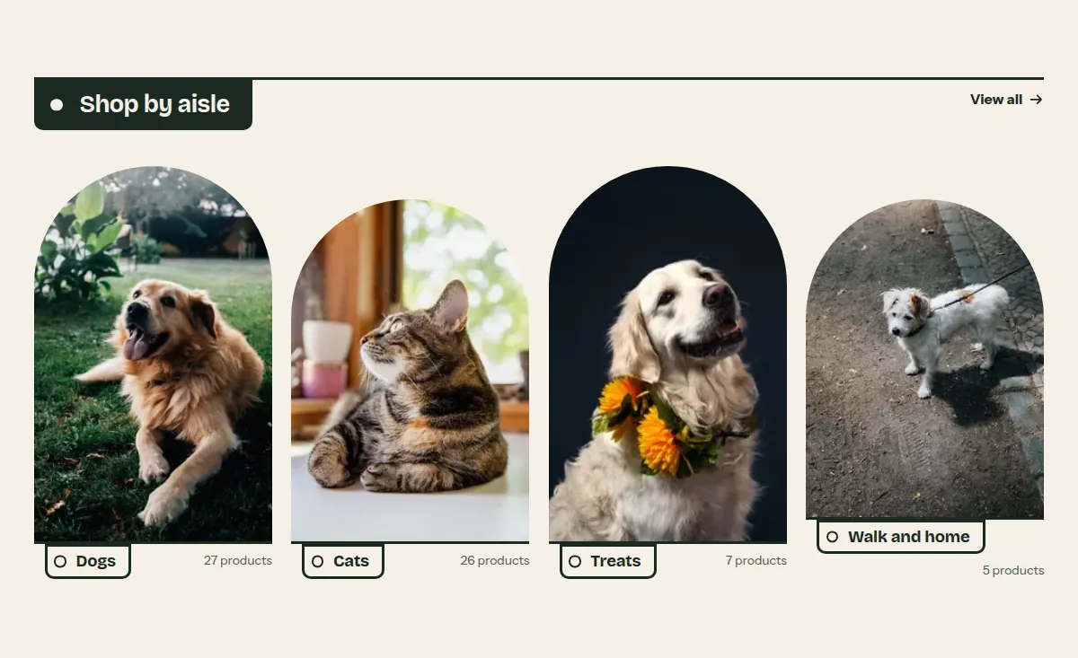
Your main collections as a row of arched images, each with its name hanging below the shelf line as a label. Use it as the quick way into your store's aisles, for example Dogs, Cats, Treats.
Where it appears: Used in template index. Can be added to any template; not to the header or footer group.
Settings Link to this heading
| Setting | What it does | Values | Default |
|---|---|---|---|
| Heading | Heading that hangs from the shelf line. A View all link to your collections list sits on the same line. | Text | “Shop by collection” |
| Show product count | Shows how many products each collection holds, next to its name. | On or off | On |
| Color scheme | Colors of the section. | Color scheme | Scheme 1 |
Blocks Link to this heading
Up to 6 blocks.
Collection Link to this heading
One collection, shown as an arched image with its name hanging below the line as a label.
| Setting | What it does | Values | Default |
|---|---|---|---|
| Collection | The collection the card links to. | Collection | — |
| ImageHint in the editor: Leave empty to use the collection image. | An image that replaces the collection image on this card only. | Image | — |
| LabelHint in the editor: Leave empty to use the collection title. | A shorter name for this card, for example Dogs instead of Dog food and treats. | Text | — |
Featured collection Link to this heading
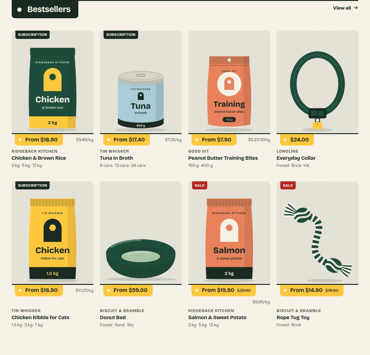
Products from one collection as product cards. Each card stands on the shelf line with its price hanging below the line as a price label, the unit price next to it when the product has one.
Where it appears: Used in template index. Can be added to any template; not to the header or footer group.
Settings Link to this heading
| Setting | What it does | Values | Default |
|---|---|---|---|
| Heading | Heading that hangs from the shelf line. A View all link to the collection sits on the same line. | Text | “Featured collection” |
| Collection | The collection the products come from, in the collection's sort order. | Collection | — |
| Products to show | Number of products in the row. | 2 to 12, in steps of 1 | 4 |
| Columns on large screens | Number of products in a row on large screens. Further products continue on the next row. Phones show two in a row, tablets three. | 3 to 5, in steps of 1 | 4 |
| Color scheme | Colors of the section. | Color scheme | Scheme 1 |
Statement Link to this heading
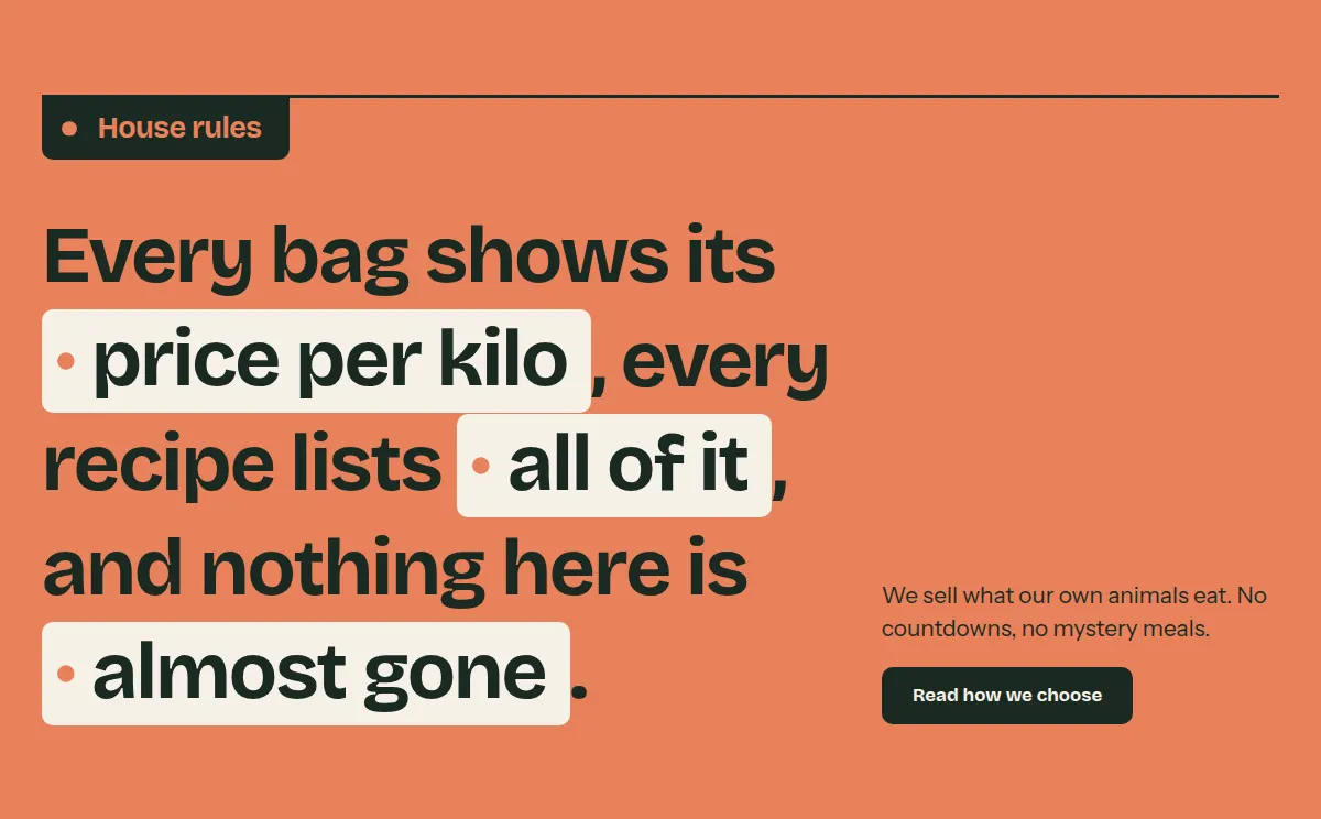
One large sentence across the page, like the cards clipped to a shop shelf. Words you set in italics in the heading are shown on labels.
Where it appears: Used in template index. Can be added to any template; not to the header or footer group.
Settings Link to this heading
| Setting | What it does | Values | Default |
|---|---|---|---|
| Label | Heading that hangs from the shelf line. | Text | “Our promise” |
| HeadingHint in the editor: Italic text is shown as a label. | The one large sentence. Set a word in italics to show it on a label. | Text with bold, italic and links | “Say what you stand for in one clear sentence.” |
| Body text | Text below the sentence. | Formatted text | — |
| Button label | Text of a button. Leave empty to hide it. | Text | — |
| Button link | Where the button leads. | Link | — |
| Color scheme | Colors of the section. The third scheme (brick) is the default. | Color scheme | Scheme 3 |
Multicolumn Link to this heading
Up to six columns, each a compartment of a shelf unit with an optional image, a heading, text and a link. Good for steps (Order, We pack, It arrives) or for what makes your store different.
Where it appears: Used in template index. Can be added to any template; not to the header or footer group.
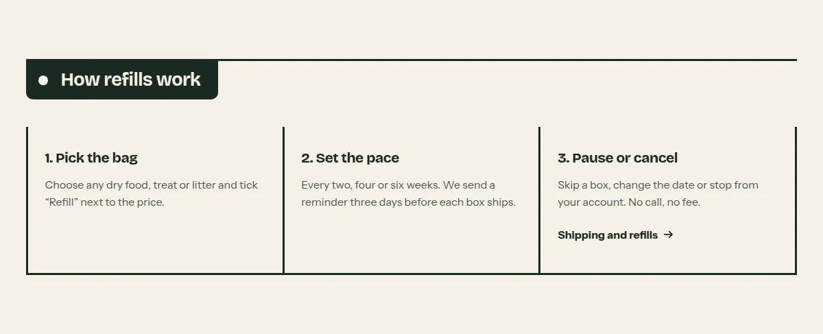
Settings Link to this heading
| Setting | What it does | Values | Default |
|---|---|---|---|
| Heading | Heading that hangs from the shelf line. | Text | “Multicolumn” |
| Body text | Text below the heading, above the columns. | Formatted text | — |
| Image sizeHint in the editor: Small shows a round image next to the heading, like a symbol. | How column images are shown: Large as an arch above the heading, Small as a round symbol, None without images. | Large, Small, None | Large |
| Columns on large screens | Number of columns side by side on large screens. | 2 to 4, in steps of 1 | 3 |
| Alignment | Alignment of the text in the columns. | Left, Center | Left |
| Button label | Text of a button below the columns. Leave empty to hide it. | Text | — |
| Button link | Where the button leads. | Link | — |
| Color scheme | Colors of the section. | Color scheme | Scheme 1 |
Blocks Link to this heading
Up to 6 blocks.
Column Link to this heading
One column with an optional image, a heading, text and a link.
| Setting | What it does | Values | Default |
|---|---|---|---|
| Image | Image of the column. | Image | — |
| Heading | Heading of the column. | Text | “Column” |
| Text | Text of the column. | Formatted text | “Pair text with an image to focus on your chosen product, collection, or service.” |
| Link label | Text of the link below the column text. | Text | — |
| Link | Where the link leads. | Link | — |
Featured product Link to this heading
One product with its image and the buying controls beside it, so customers can add it to the cart from any page. The blocks decide what is shown and in which order.
Where it appears: Used in template index. Can be added to any template; not to the header or footer group.
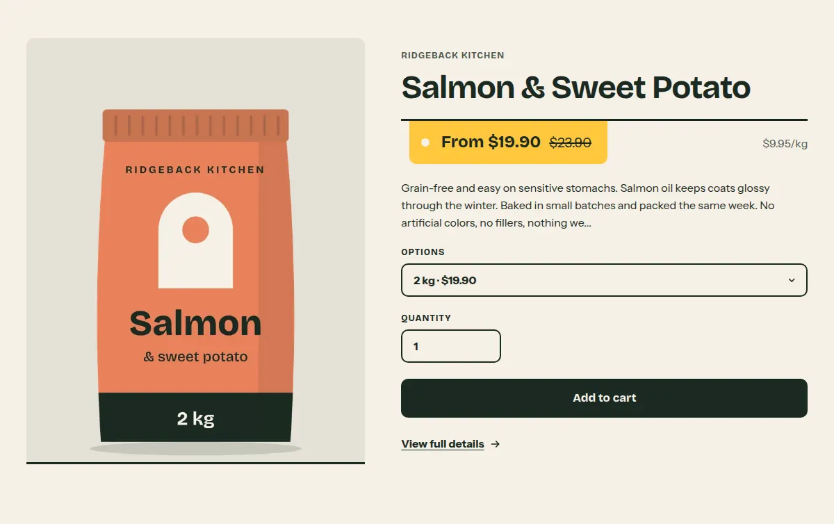
Settings Link to this heading
| Setting | What it does | Values | Default |
|---|---|---|---|
| Product | The product to show. Customers can choose a variant and add it to the cart without leaving the page. | Product | — |
| Image position | Side of the product image on large screens. | Left, Right | Left |
| Color scheme | Colors of the section. | Color scheme | Scheme 1 |
Blocks Link to this heading
App blocks Link to this heading
Blocks that apps provide, for example product reviews. They appear under Add block once the app is installed.
Vendor Link to this heading
The product's vendor. Can be used once per section.
Title Link to this heading
The product title, linking to the product page. Can be used once per section.
Price Link to this heading
The price, the compare-at price on sale, and the unit price when the variant has one. Can be used once per section.
| Setting | What it does | Values | Default |
|---|---|---|---|
| Show tax note | Shows “Taxes included.” below the price when your prices include tax. | On or off | On |
Description Link to this heading
The start of the product description as plain text. Can be used once per section.
| Setting | What it does | Values | Default |
|---|---|---|---|
| Description length in words | How many words of the description are shown. | 10 to 80, in steps of 5 | 30 |
Variant picker Link to this heading
A drop-down menu with the product's variants. Hidden when the product has only one variant. Can be used once per section.
Quantity selector Link to this heading
A field for the quantity. Can be used once per section.
Buy buttons Link to this heading
The Add to cart button and, if you turn it on, the dynamic checkout buttons. Can be used once per section.
| Setting | What it does | Values | Default |
|---|---|---|---|
| Show dynamic checkout buttonsHint in the editor: Customers see their preferred payment method, such as PayPal or Apple Pay. | Adds express payment buttons, such as Shop Pay, below Add to cart. | On or off | On |
Custom Liquid Link to this heading
Your own Liquid or HTML inside the product information, for example an app snippet.
| Setting | What it does | Values | Default |
|---|---|---|---|
| Custom LiquidHint in the editor: Add app snippets or other code to create advanced customizations. | The Liquid or HTML to output. | Liquid code | — |
Image with text Link to this heading
An arched image beside a heading, text, a button and a short list of details. Use it for your story or to explain one thing well.
Where it appears: Used in template index. Can be added to any template; not to the header or footer group.
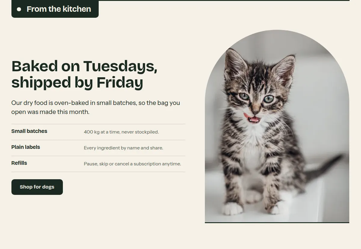
Settings Link to this heading
| Setting | What it does | Values | Default |
|---|---|---|---|
| Label | Heading that hangs from the shelf line above the section. | Text | “About us” |
| ImageHint in the editor: 3:4 aspect ratio recommended | The image in the arch. | Image | — |
| Image position | Side of the image on large screens. | Left, Right | Left |
| Heading | Heading beside the image. | Text | “Image with text” |
| Body text | Text below the heading. | Formatted text | “Pair an image with text to tell customers about your store, a product, or how you work.” |
| Button label | Text of the button. Leave empty to hide it. | Text | — |
| Button link | Where the button leads. | Link | — |
| Color scheme | Colors of the section. | Color scheme | Scheme 1 |
Blocks Link to this heading
Up to 5 blocks.
Detail Link to this heading
One short fact below the text, with a title and a line, for example Since 2019 · Family run.
| Setting | What it does | Values | Default |
|---|---|---|---|
| Title | Title of the detail. | Text | “Detail” |
| Text | Line below the title. | Text | “Add a short line about this detail.” |
Testimonials Link to this heading
Quotes from customers, shown as notes hanging from a rail. You type the quotes in yourself; the section does not connect to a review app.
Where it appears: Used in template index. Can be added to any template; not to the header or footer group.
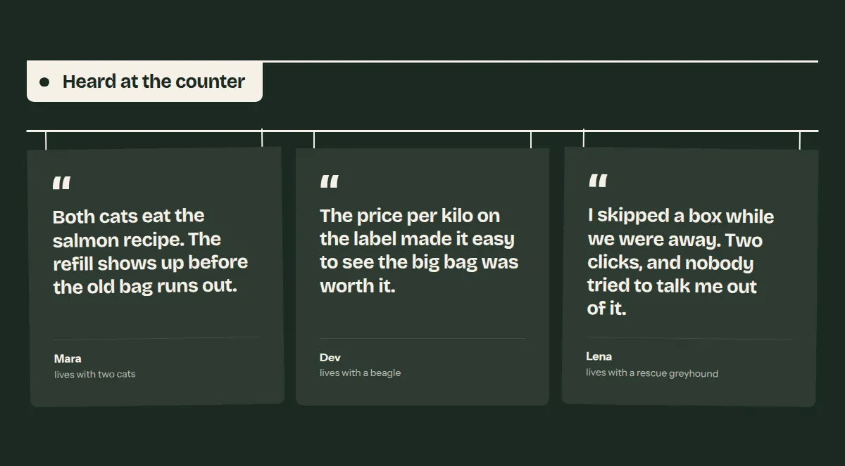
Settings Link to this heading
| Setting | What it does | Values | Default |
|---|---|---|---|
| Heading | Heading that hangs from the shelf line. | Text | “Testimonials” |
| Color scheme | Colors of the section. | Color scheme | Scheme 1 |
Blocks Link to this heading
Up to 9 blocks.
Quote Link to this heading
One quote from a customer, which you type in yourself. Only use words a customer actually wrote to you.
| Setting | What it does | Values | Default |
|---|---|---|---|
| Quote | The words of the customer. | Text | “Share a few words a customer wrote about your store or products.” |
| Author | Name of the customer, as they agreed to be named. | Text | “Customer name” |
| DetailsHint in the editor: For example a city or how long they have been a customer. | A short line below the name. | Text | — |
| ImageHint in the editor: Shown small and round next to the author. | A small photo, for example of the customer's pet. | Image | — |
Blog posts Link to this heading
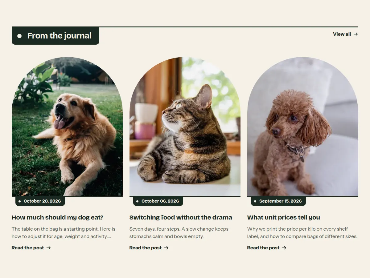
The newest posts of one blog as cards, with a link to the blog on the shelf line.
Where it appears: Used in template index. Can be added to any template; not to the header or footer group.
Settings Link to this heading
| Setting | What it does | Values | Default |
|---|---|---|---|
| Heading | Heading that hangs from the shelf line. | Text | “From the blog” |
| Blog | The blog whose newest posts are shown. Without a blog, the editor shows placeholder cards. | Blog | — |
| Posts to show | Number of posts in the row. | 2 to 4, in steps of 1 | 3 |
| Link labelHint in the editor: Shown on the line when a blog with posts is selected. | Text of the link to the blog on the right of the line. | Text | “View all” |
| Show featured image | Shows each post's featured image. | On or off | On |
| Show date | Shows the publishing date on each card. | On or off | On |
| Show author | Shows the author's name on each card. | On or off | Off |
| Show excerpt | Shows the excerpt, or the start of the post when there is no excerpt. | On or off | On |
| Color scheme | Colors of the section. | Color scheme | Scheme 1 |
Hutch theme documentation · theme version 1.0.0 · last updated November 16, 2026 · Contact support · Legal notice