More sections Link to this heading
Sections you can add to any page from Add section in the theme editor. They are not on the home page after installation.
Rich text Link to this heading
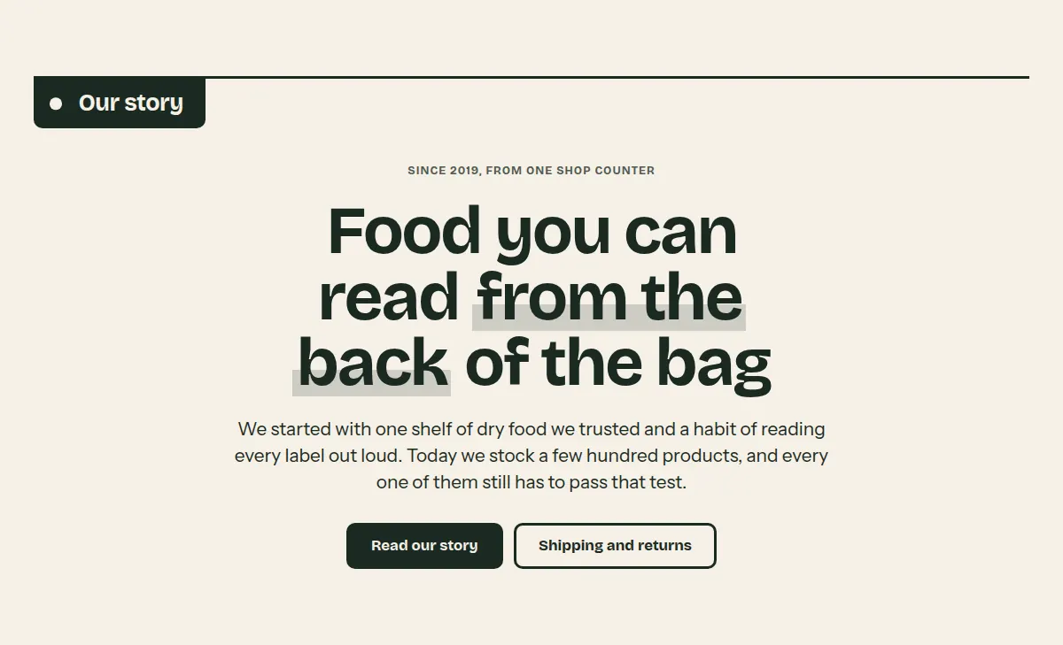
A quiet column of text: subheading, heading, text and buttons in any order you like.
Where it appears: Can be added to any template; not to the header or footer group.
Settings Link to this heading
| Setting | What it does | Values | Default |
|---|---|---|---|
| Label | Heading that hangs from the shelf line. | Text | — |
| Alignment | Alignment of the text. | Left, Center | Center |
| Width | Width of the text column. | Narrow, Wide | Narrow |
| Color scheme | Colors of the section. | Color scheme | Scheme 1 |
Blocks Link to this heading
Up to 8 blocks.
Subheading Link to this heading
A small line of text, usually above the heading. Can be used up to 2 times.
| Setting | What it does | Values | Default |
|---|---|---|---|
| Text | Text of the subheading. | Text | “Subheading” |
Heading Link to this heading
A heading. Can be used up to 2 times.
| Setting | What it does | Values | Default |
|---|---|---|---|
| HeadingHint in the editor: Italic text is underlined. | Text of the heading. | Text with bold, italic and links | “Talk about your brand” |
| Heading size | Size of the heading. | Small, Medium, Large | Medium |
Text Link to this heading
A paragraph of text. Can be used up to 3 times.
| Setting | What it does | Values | Default |
|---|---|---|---|
| Text | The text. | Formatted text | “Share information about your brand with your customers. Describe a product, make announcements, or welcome customers to your store.” |
| Use large text | Sets the text in a larger size, for an introduction. | On or off | Off |
Buttons Link to this heading
One or two buttons. Can be used up to 2 times.
| Setting | What it does | Values | Default |
|---|---|---|---|
| Button label | Text of the first button. Leave empty to hide it. | Text | “Button label” |
| Button link | Where the first button leads. | Link | — |
| Second button label | Text of the second button. Leave empty to hide it. | Text | — |
| Second button link | Where the second button leads. | Link | — |
Image banner Link to this heading
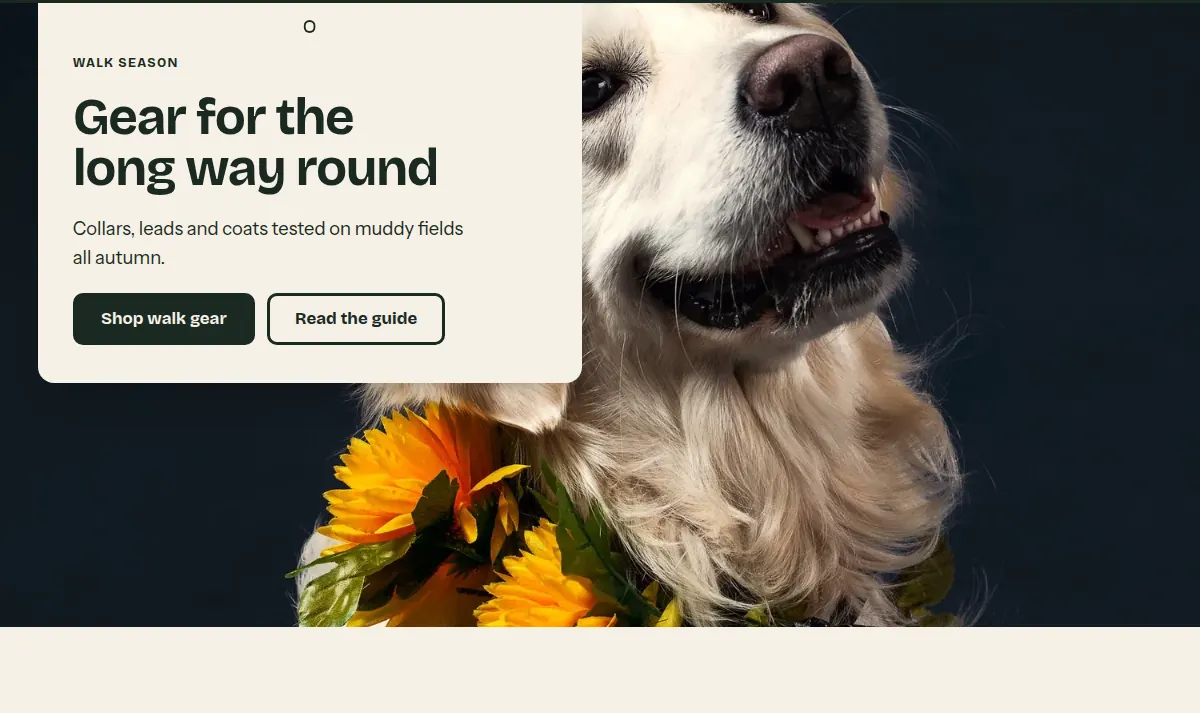
A wide photo across the full width of the page. The text never sits on the photo itself: it is printed on a sign that hangs from the shelf line, so it stays readable on any image.
Where it appears: Can be added to any template; not to the header or footer group.
Settings Link to this heading
| Setting | What it does | Values | Default |
|---|---|---|---|
| ImageHint in the editor: 2400 x 1200px .jpg recommended | The photo across the full width of the page. | Image | — |
| Height | Height of the photo. Adapt to image keeps the photo's own proportions. | Small, Medium, Large, Adapt to image | Medium |
| Text positionHint in the editor: The text sits on a sign, so it stays readable on any image. | Where the sign with the text hangs on large screens. On phones it hangs below the photo. | Left, Center, Right | Left |
| Text | |||
| Label | A short line above the heading on the sign. | Text | — |
| Heading | Heading on the sign. | Text | “Image banner” |
| Body text | Text on the sign. | Formatted text | “Use a wide photo to set the mood for a season, a new range or your store itself.” |
| Button label | Text of the first button. Leave empty to hide it. | Text | “Shop now” |
| Button link | Where the first button leads. | Link | — |
| Second button label | Text of a second button. Leave empty to hide it. | Text | — |
| Second button link | Where the second button leads. | Link | — |
| Color scheme | Colors of the sign. | Color scheme | Scheme 1 |
Slideshow Link to this heading
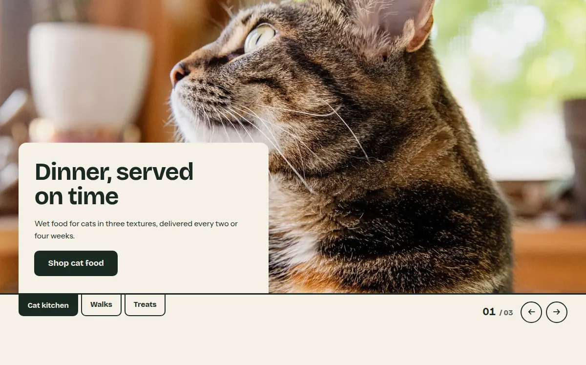
Up to five slides, each a photo with a sign below it. Tabs and a counter hang from the shelf line. Without JavaScript the slides scroll sideways and every slide stays reachable.
Where it appears: Can be added to any template; not to the header or footer group.
Settings Link to this heading
| Setting | What it does | Values | Default |
|---|---|---|---|
| DescriptionHint in the editor: Read aloud by screen readers. Leave empty to use "Slideshow". | Name of the slideshow for screen readers. | Text | — |
| Height | Height of the slides. | Small, Medium, Large | Medium |
| Auto-rotate slidesHint in the editor: Shows a pause button. Stops while a visitor points at or tabs into the slides, and never runs for visitors who prefer reduced motion. | Moves to the next slide on its own. | On or off | Off |
| Change slides everyShown in the editor only when Auto-rotate slides is on. | Time each slide stays before the next one appears. | 3 to 9 s, in steps of 1 | 5 s |
| Color scheme | Colors of the signs and controls. | Color scheme | Scheme 1 |
Blocks Link to this heading
Up to 5 blocks.
Slide Link to this heading
One slide with a photo and a sign with text below it.
| Setting | What it does | Values | Default |
|---|---|---|---|
| ImageHint in the editor: 2400 x 1200px .jpg recommended | Photo of the slide. | Image | — |
| Tab labelHint in the editor: Short name on the tab below the slide. Leave empty to show the slide number. | Name on the tab that selects this slide. | Text | — |
| Heading | Heading on the sign. | Text | “Image slide” |
| Body text | Text on the sign. | Formatted text | “Tell your brand's story through images.” |
| Button label | Text of the button. Leave empty to hide it. | Text | “Shop now” |
| Button link | Where the button leads. | Link | — |
Video Link to this heading
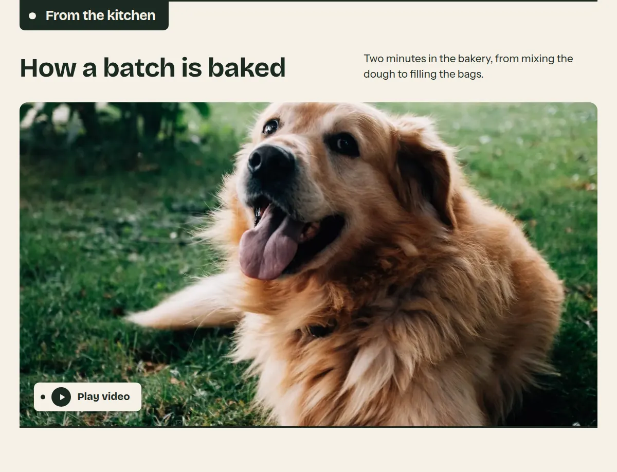
A video in a frame on the shelf line. Only the cover image and a play button load with the page; the video itself loads after the visitor selects play. See Video.
Where it appears: Can be added to any template; not to the header or footer group.
Settings Link to this heading
| Setting | What it does | Values | Default |
|---|---|---|---|
| Label | Heading that hangs from the shelf line. | Text | “Video” |
| Heading | Heading above the video. | Text | “Show how it works” |
| Body text | Text below the heading. | Formatted text | — |
| Video | |||
| Shopify-hosted videoHint in the editor: Shown instead of the video link when both are set. | A video you uploaded to Shopify (Content > Files). | Video from your Shopify files | — |
| Video linkHint in the editor: Accepts YouTube or Vimeo links. | Link to a YouTube or Vimeo video. | YouTube or Vimeo link | https://www.youtube.com/watch?v=_9VUPq3SxOc |
| Cover imageHint in the editor: Add a cover image for YouTube and Vimeo links. Their preview image isn't loaded before the video is played, so without a cover the frame shows a plain plate with a play button. 16:9 recommended. Empty for a Shopify-hosted video: its own preview image is used. | Image shown in the frame until the visitor plays the video. | Image | — |
| DescriptionHint in the editor: Describes the video for screen readers. | Name of the video for screen readers, for example what it shows. | Text | — |
| Color scheme | Colors of the section. | Color scheme | Scheme 1 |
Logo list Link to this heading
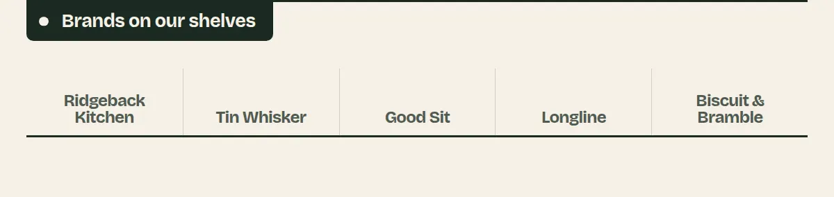
Logos of brands you carry or of press mentions, standing on shelf boards. Without an image, the name is set as text.
Where it appears: Can be added to any template; not to the header or footer group.
Settings Link to this heading
| Setting | What it does | Values | Default |
|---|---|---|---|
| Heading | Heading that hangs from the shelf line. | Text | “Logo list” |
| Logo height | Height of every logo. Widths follow the logos' own proportions. | 24 to 96 px, in steps of 4 | 48 px |
| Mute logo colorsHint in the editor: Shows logos in gray until a linked logo is hovered. | Shows all logos in one quiet color, which keeps a mixed set of logos calm. | On or off | On |
| Color scheme | Colors of the section. | Color scheme | Scheme 1 |
Blocks Link to this heading
Up to 12 blocks.
Logo Link to this heading
One logo, for example of a brand you carry or a press mention.
| Setting | What it does | Values | Default |
|---|---|---|---|
| ImageHint in the editor: 320 x 160px .png with a transparent background recommended | The logo image. | Image | — |
| NameHint in the editor: Used as alt text, and shown as text when no image is selected. | Name of the brand or publication. | Text | — |
| Link | Makes the logo a link. | Link | — |
Collapsible content Link to this heading
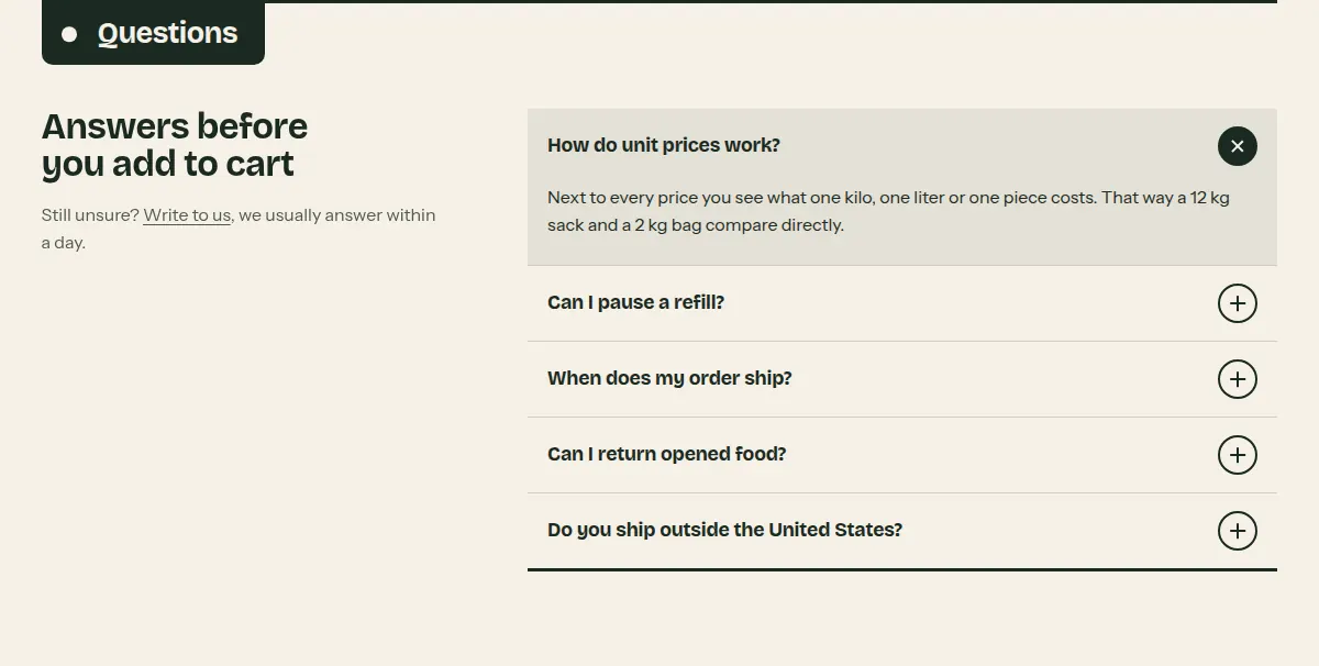
Rows that open and close, for questions and answers or short topics like shipping and returns. Works without JavaScript.
Where it appears: Can be added to any template; not to the header or footer group.
Settings Link to this heading
| Setting | What it does | Values | Default |
|---|---|---|---|
| Heading | Heading that hangs from the shelf line. | Text | “Collapsible content” |
| Subheading | A larger line of text shown beside the rows. | Text | — |
| Body textHint in the editor: Shown beside the rows on large screens. | Text below the subheading, for example where to find more help. | Formatted text | — |
| Open first row | Shows the first row open when the page loads. | On or off | Off |
| Color scheme | Colors of the section. | Color scheme | Scheme 1 |
Blocks Link to this heading
Up to 20 blocks.
Collapsible row Link to this heading
One row that opens and closes, for a question and its answer or a short topic.
| Setting | What it does | Values | Default |
|---|---|---|---|
| Heading | The visible line, for example a question. | Text | “Collapsible row” |
| Text | The content shown when the row is open. | Formatted text | “Use this row to answer a common question or to share details about shipping, returns, or care.” |
Newsletter Link to this heading
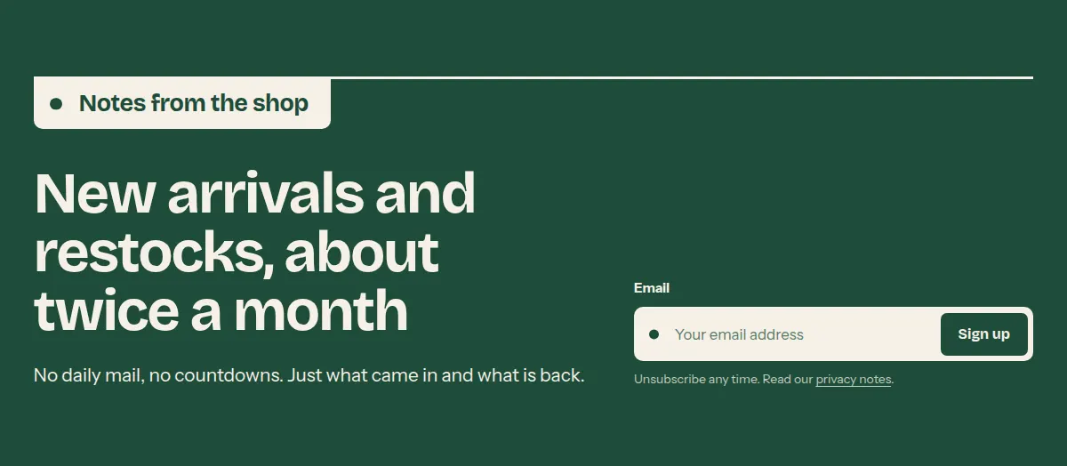
An email signup with one large sentence and a field shaped like a shelf label. Everyone who signs up is added to your customers in the Shopify admin, tagged newsletter.
Where it appears: Can be added to any template; not to the header or footer group.
Settings Link to this heading
| Setting | What it does | Values | Default |
|---|---|---|---|
| Label | Heading that hangs from the shelf line. | Text | “Newsletter” |
| Heading | The large sentence of the section. | Text with bold, italic and links | “Subscribe to our emails” |
| Body text | Text below the sentence. | Formatted text | “Tell customers what they get when they sign up, such as new arrivals or offers, and how often you write.” |
| NoteHint in the editor: Shown below the field, for example a link to your privacy policy. | Small print below the field. | Formatted text | — |
| Color scheme | Colors of the section. | Color scheme | Scheme 2 |
Custom Liquid Link to this heading
Outputs your own Liquid or HTML, for app snippets and other advanced changes. You can add it to any template and to the header and footer groups. See Custom Liquid and app blocks.
Where it appears: Can be added to any template and to the header and footer groups.
Settings Link to this heading
| Setting | What it does | Values | Default |
|---|---|---|---|
| Liquid codeHint in the editor: Add app snippets or other code to create advanced customizations. | The Liquid or HTML to output. See Custom Liquid and app blocks. | Liquid code | — |
| Use full page width | Lets the code use the full screen width instead of the page width. | On or off | Off |
| Bottom spacing | Space below the section. | None, Small, Large | Large |
| Color scheme | Colors around your code. | Color scheme | Scheme 1 |
Hutch theme documentation · theme version 1.0.0 · last updated November 16, 2026 · Contact support · Legal notice