Header and footer Link to this heading
The header group (announcement bar and header) and the footer group appear on every page except the password page and the gift card page.
Announcement bar Link to this heading
Short messages in a narrow band above the header. One message is plain text; with several, customers can move between them with previous and next buttons. Without JavaScript the messages scroll sideways.
Where it appears: Used in section group header-group. Can be added to the header group only.

Settings Link to this heading
| Setting | What it does | Values | Default |
|---|---|---|---|
| Auto-rotate announcementsHint in the editor: Shows a pause button. Stops while a visitor points at or tabs into the bar, and never runs for visitors who prefer reduced motion. | Moves to the next announcement on its own when there is more than one. | On or off | Off |
| Change announcements everyShown in the editor only when Auto-rotate announcements is on. | Time each announcement stays before the next one appears. | 3 to 9 s, in steps of 1 | 5 s |
| Color scheme | Colors of the bar. | Color scheme | Scheme 2 |
Blocks Link to this heading
Up to 5 blocks.
Announcement Link to this heading
One short message. Blocks with empty text are skipped.
| Setting | What it does | Values | Default |
|---|---|---|---|
| Text | The message. Keep it to one line on a phone. | Text | “Welcome to our store” |
| Link | Makes the whole message a link. | Link | — |
Header Link to this heading
Logo, an always visible search field, account and cart on the first row. Below, the main menu as tabs standing on the first shelf line. A tab with child links opens a bay with the second and third menu level. On phones the tabs stay visible and scroll sideways.
Where it appears: Used in section group header-group. Cannot be added from Add section; it is part of the template.

Settings Link to this heading
| Setting | What it does | Values | Default |
|---|---|---|---|
| Logo | Your logo. Without a logo, the store name is shown in the heading font. | Image | — |
| Logo width | Width of the logo on large screens. | 60 to 240 px, in steps of 10 | 120 px |
| Main menu | The menu shown as tabs below the logo. Links with second-level links open a bay with up to three levels. | Menu | Menu with the handle main-menu |
| Show collection imagesHint in the editor: Shown beside second-level menu links that point to a collection. | Shows the collection image beside each second-level link that points to a collection, inside the opened bay. See Menu bay with collection images. | On or off | On |
| Customer account menu | Menu shown in the account pop-up for signed-in customers. Used when customer accounts are turned on in your store. | Menu | Menu with the handle customer-account-main-menu |
| Color scheme | Colors of the header and the menu bay. | Color scheme | Scheme 1 |
Footer Link to this heading
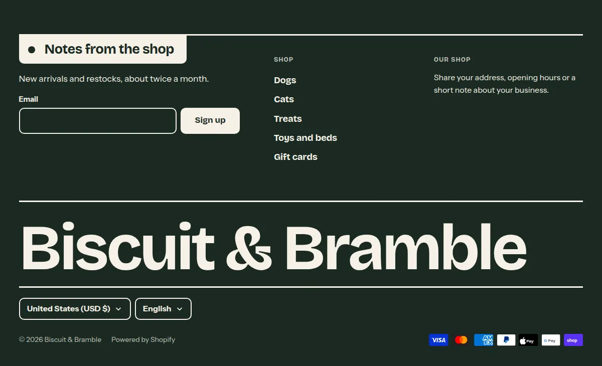
The lowest shelf of the page, in the dark color scheme: email signup, up to four menu or text columns, your store name as a large wordmark, then country and language selectors, social icons, policy links and payment icons.
Where it appears: Used in section group footer-group. Cannot be added from Add section; it is part of the template.
Settings Link to this heading
| Setting | What it does | Values | Default |
|---|---|---|---|
| Newsletter | |||
| Show email signup | Shows an email signup at the top of the footer. Everyone who signs up is added to your customers in the Shopify admin, tagged newsletter. | On or off | On |
| Heading | Heading of the email signup. | Text | “Notes from the shop” |
| Body text | Short line below that heading, for example how often you write. | Formatted text | “New arrivals and restocks, about twice a month.” |
| Wordmark | |||
| Show wordmark | Shows your store name, or your own text, in large type across the footer. | On or off | On |
| Wordmark textHint in the editor: Leave empty to use the store name. | Text of the wordmark. | Text | — |
| Country and language | |||
| Show country/region selectorHint in the editor: Shown when the store sells to more than one country or region. Add them in your Markets settings. | Lets customers choose their country or region, which also sets the currency. | On or off | On |
| Show language selectorHint in the editor: Shown when the store is published in more than one language. | Lets customers choose the language of the store. | On or off | On |
| Links and payment | |||
| Show social media iconsHint in the editor: Add your links in Theme settings > Social media. | Shows icons for the social media links from Social media. | On or off | On |
| Show Follow on Shop buttonHint in the editor: Shop Pay must be enabled for the button to show. | Shows the Follow on Shop button, so customers can follow your store in the Shop app. | On or off | On |
| Show policy links | Lists links to the policies you have added in your Shopify admin, such as the refund policy. | On or off | On |
| Show payment icons | Shows the icons of the payment methods your store accepts. | On or off | On |
| Color scheme | Colors of the footer. The fourth scheme (dark) is the default. | Color scheme | Scheme 4 |
Blocks Link to this heading
Up to 4 blocks.
Menu Link to this heading
A column with the links of one menu.
| Setting | What it does | Values | Default |
|---|---|---|---|
| Menu | The menu to list. Only the first level of the menu is shown. | Menu | Menu with the handle footer |
| HeadingHint in the editor: Leave empty to use the menu title. | Heading above the links. | Text | — |
Text Link to this heading
A column with a heading and a short text, for example your address and opening hours.
| Setting | What it does | Values | Default |
|---|---|---|---|
| Heading | Heading of the column. | Text | “Our shop” |
| Body text | Text of the column. | Formatted text | “Share your address, opening hours or a short note about your business.” |
Hutch theme documentation · theme version 1.0.0 · last updated November 16, 2026 · Contact support · Legal notice